
RSA Rebrand
BRAND DESIGN & STRATEGY
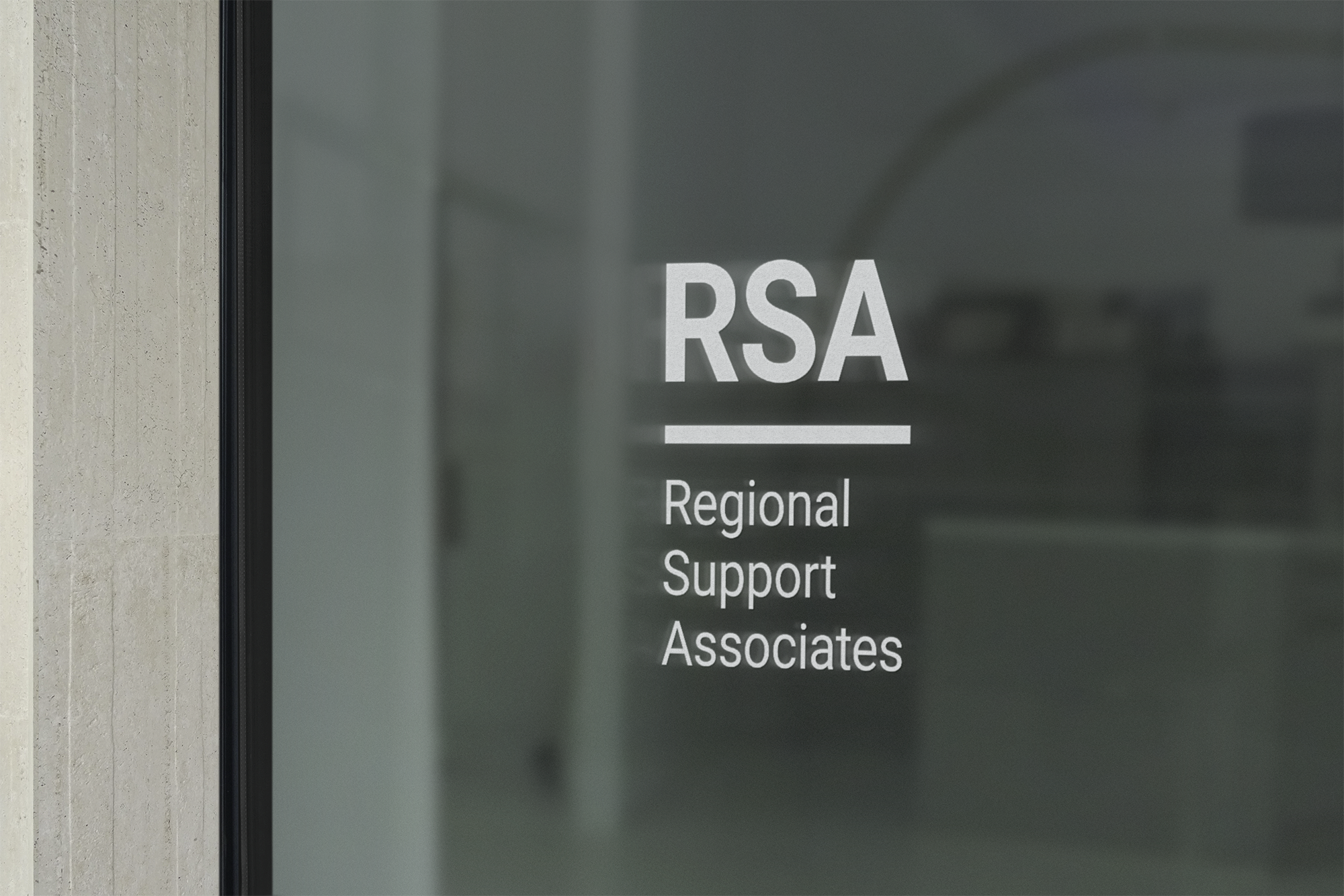
This project involved the complete rebrand of Regional Support Associates, a public healthcare organisation based in southwestern Ontario. RSA was looking for a brand which was impactful, communicated clearly, and reflected the professionalism of the organisation. We worked on a new logo, typefaces, colour palette, brand strategy, brand rationale, and a series of collateral ranging from signage, to business cards, to PowerPoint templates.
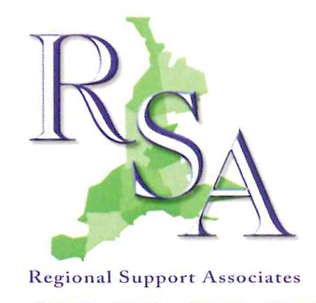
Previous RSA Branding
The previous RSA brand was developed multiple decades previous, when the organisation was first formed. Though it had served RSA efficiently for a number of years, it had become outdated and no longer reflected the current work being done by the organisation. The highlighted serif type didn’t have the visual impact that was needed to work across various media and at a range of sizes, or to be easily recognisable by clients and partners.


Design Process: Moodboards
The first phase of the rebrand was to develop moodboards to explore various visual directions. Finding a visual style which resonates and fits with an organisation’s identity and future goals is a critical initial step of the branding process. It helps to ensure that we find a visual language which works effectively to communicate to stakeholders exactly what this organisation is about — core values, how they serve their audience, and where they are headed.

Direction #1
This moodboard presents RSA as approachable, transparent, and supportive. The bright greens feel fresh and contemporary and the darker blue and charcoal grey are more neutral and calming. The rounded terminals of the typefaces soften the profile of the letters and suggest an open, collaborative nature. Keeping blue and green as the brand colours keeps an association with the previous brand, whilst looking forward to the future of the organisation.

Direction #2
This moodboard presents RSA as competent, effective, and responsive. The navy blue colour represents a sense of trust, whilst the green is visually engaging and the limited use of orange draws attention and creates a sense of urgency. The structural nature of the typeface is more authoritative than those shown in the first moodboard and suggests reliability and pragmatism.

Direction #3
This moodboard presents RSA as forward-thinking, evolving, and relevant. Acknowledging the evolution and expansion of the organisation’s work, there is a dynamic play between the calming blue tones and soft, but visually stimulating, orange tone. The geometrically informed typefaces offer an element of contemporaneity and creativity, whilst maintaining structural form.
Concept Development
Once we had established that Direction #2 most resonated with RSA’s identity and future goals, we worked through an extensive series of explorations to find the perfect form for the logo. Legibility was one of the most important qualities, as was communicating professionalism and effectiveness. In addition to developing the English logo, we were also tasked with designing a French version. Designing for two languages requires careful consideration of detail to ensure that the two logos will present as equivalent forms, neither more important than the other.


Brand Elements
After extensive iteration and a successful process of collaboration with RSA, we were able to develop French and English logos, select specific typefaces and identify where and how they should be used, and curate a colour palette which is both functional and representative of different organisational values.


Brand Guideline
One of the most important deliverables of a branding project is the brand guideline — this is the document that tells people how to use the various brand elements, so that the new brand is understood, used effectively, and (most importantly) presented consistently across all platforms and contexts.
We also worked with RSA to develop a brand rationale, which explained to partners and clients the reason for the rebrand and the strategy behind this new visual direction. It helped staff understand the shift the organisation was taking and, in turn, explain it to their clients and partners so that everyone across the organisation could embrace and learn about this new visual strategy.
In addition to the brand strategy and visual components, we delivered design for: business cards, letterhead, PowerPoint presentation templates, way-finding signage, and a strategic plan document.
