
ManCave Medicine Rebrand
BRAND DESIGN & STRATEGY
This project involved the complete rebrand of ManCave Medicine, a company dedicated to improving the health and wellness of men through diet, sleep, exercise, and other holistic methods. ManCave medicine is an emerging venture which had a basic logo that didn’t quite fit with the look and feel of the brand and no other brand identity or strategy had been established. I worked with the client to revise the logo design, create alternate logo formats, build a colour palette, typography selection, and visual style for photography.
In addition to the brand, I built a Squarespace website where the client could continue to add and change content as their needs grew, and created a series of branded Canva templates to support their social media marketing. The focus of the website is on education and storytelling, to help the target audience understand how ManCave Medicine can help them.

Previous Branding
The previous ManCave Medicine brand included this single logo, which somewhat aligned with the client’s ideas but didn’t establish the type of visual presence they were hoping for. The very narrow aspect ratio of the brand made it difficult to deploy across different platforms, from social media to merchandise. The goal of the rebrand was to create a brand which was more versatile, better connected to the target audience (men, ages 35-65, experiencing one or more health issues), and could adapt as different areas of the business are developed.

Design Process: Moodboard
The first phase of the rebrand was to develop a moodboard to explore various visual directions. Finding a visual style which resonates and fits with an organisation’s identity and future goals is a critical initial step of the branding process. It helps to ensure that we find a visual language which works effectively to communicate to stakeholders exactly what this organisation is about — core values, how they serve their audience, and where they are headed.
The client originally wanted to explore what the original logo might look like in a range of other typeface options but after mocking these up, we decided to create something original. We also explored other aspects of the look and feel of the brand including an earthy but vibrant colour palette, natural textures, and a casual, candid style of stock photography.
Design Process: Brand Values
As we built out ideas for the brand strategy, we came up with a series of keywords which encapsulate the values of the brand. These keywords helped to solidify core values and feelings that we want clients to feel and the branding to represent.
We started with where potential clients might currently be in their health journey: lethargic, fed up, low mood, chronic pain, restless, unconfident, then thought about what we wanted them to experience: oasis, strength, full of life, holistic, refresh, hopeful, positive, full of life.
Final Brand
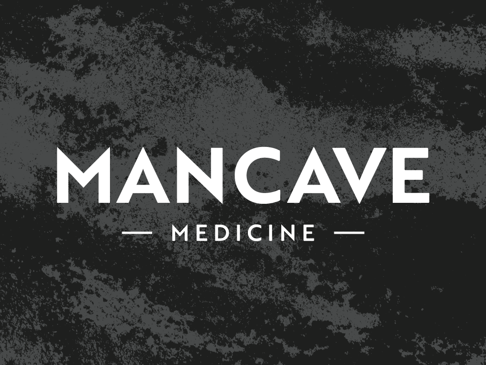
The completed brand includes a primary logo and a monogram. The primary logo has multiple variations, one with “functional medicine coaching” and one without, as the business explores ideas for services outside of coaching. The monogram works at a very small size and serves as a strong option for use cases such as embroidered polo shirts, social media watermarks, and stickers. Because the typeface chosen for the wordmark is clean and geometric, we also chose a texture which can be used to add a natural and tactile feel to both print and digital materials.


Website Walkthrough
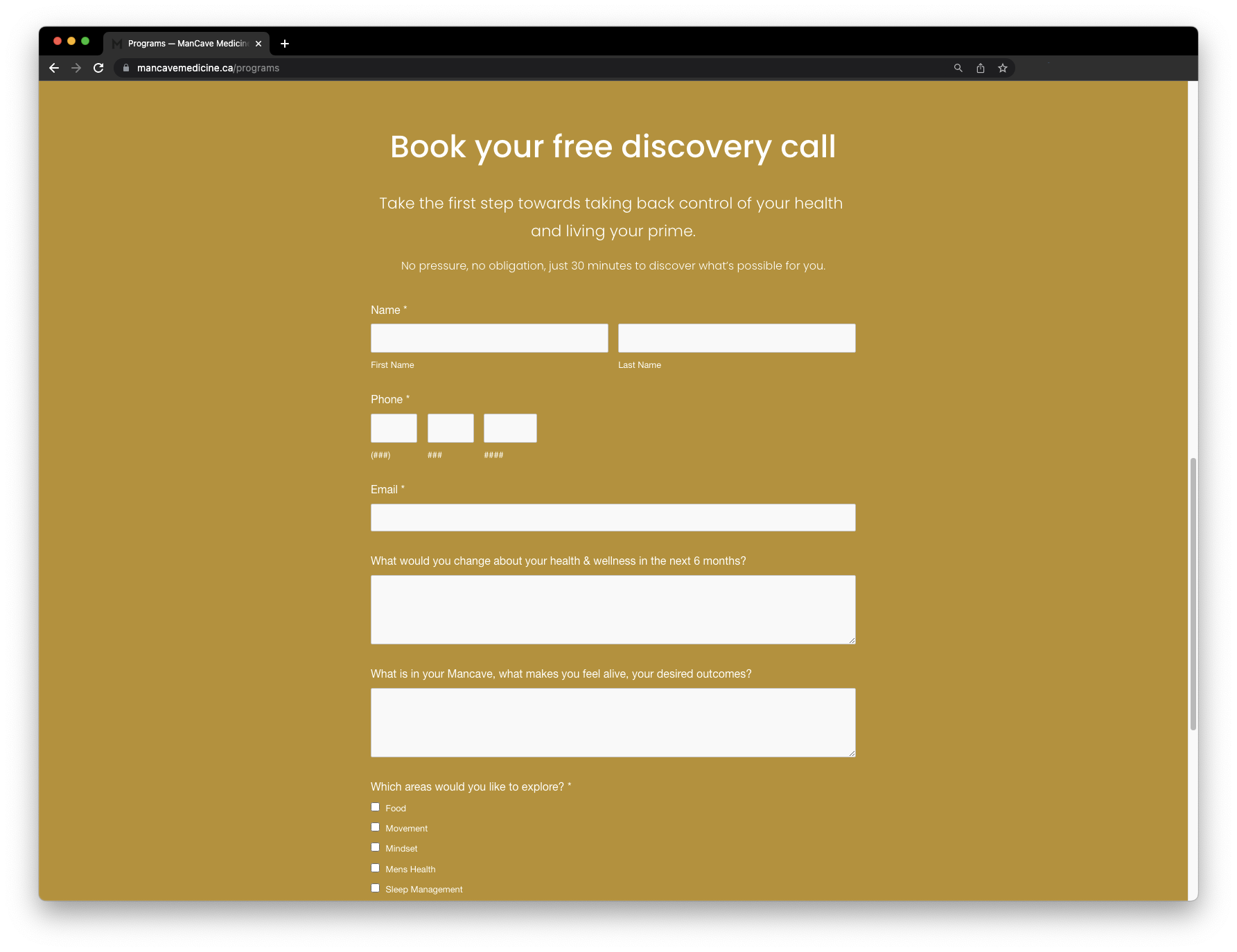
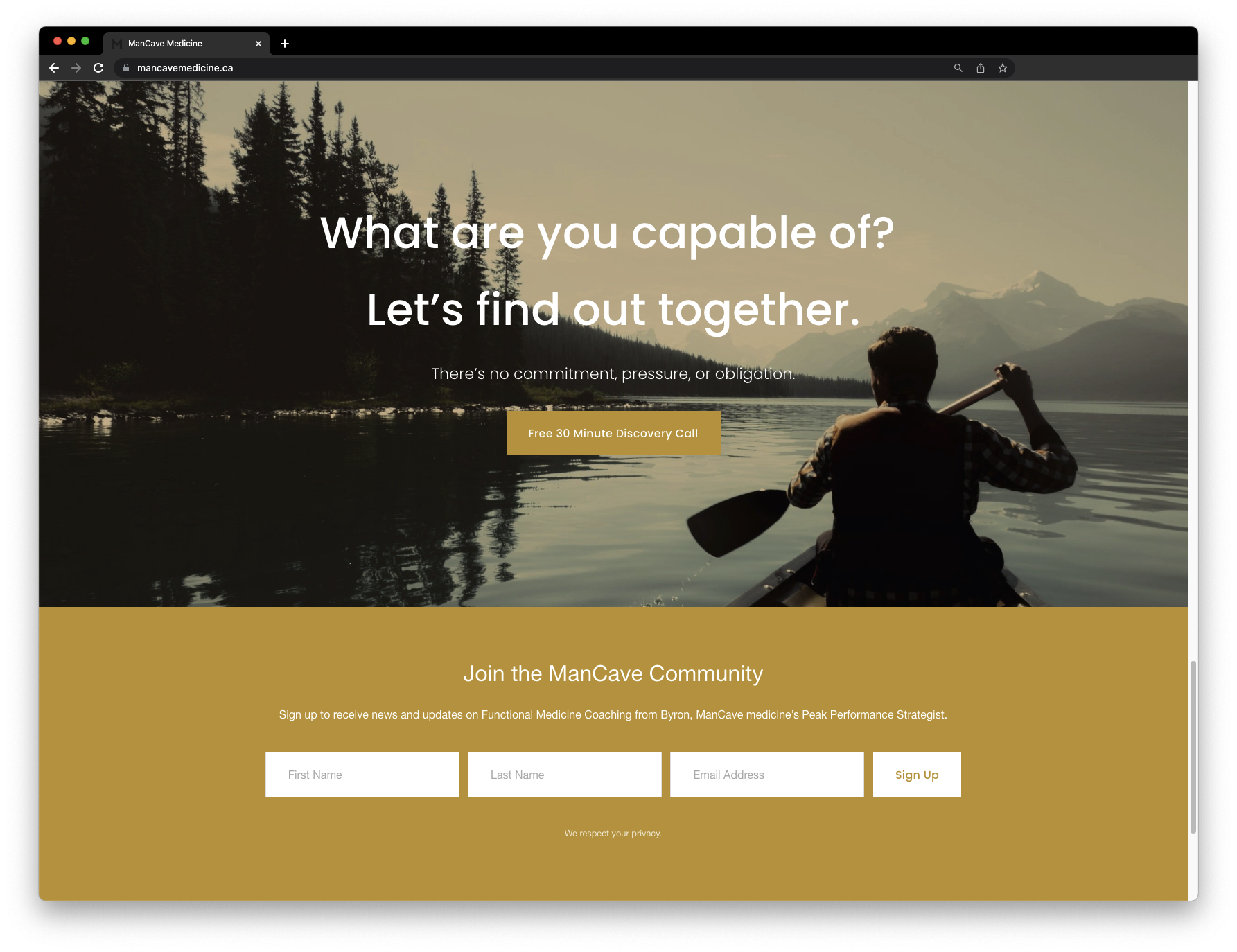
The client wanted a website which could tell the personal story of the brand’s founder, serve as an educational resource, and connect people with services and events from ManCave Medicine. We created several sections including “story,” “medicine,” “retreats,” “mission,” and “programs.” We also created a custom intake form for new clients to connect them with programming and collect information about which areas of their health they could use help with. The website was built in Squarespace because of the platform’s ease of use. Training sessions with the client set them up to be able to edit and add content themselves, once the project was completed. Play the video below to see a walkthrough of the website.