

Woodfield Construction
BRAND DESIGN & STRATEGY
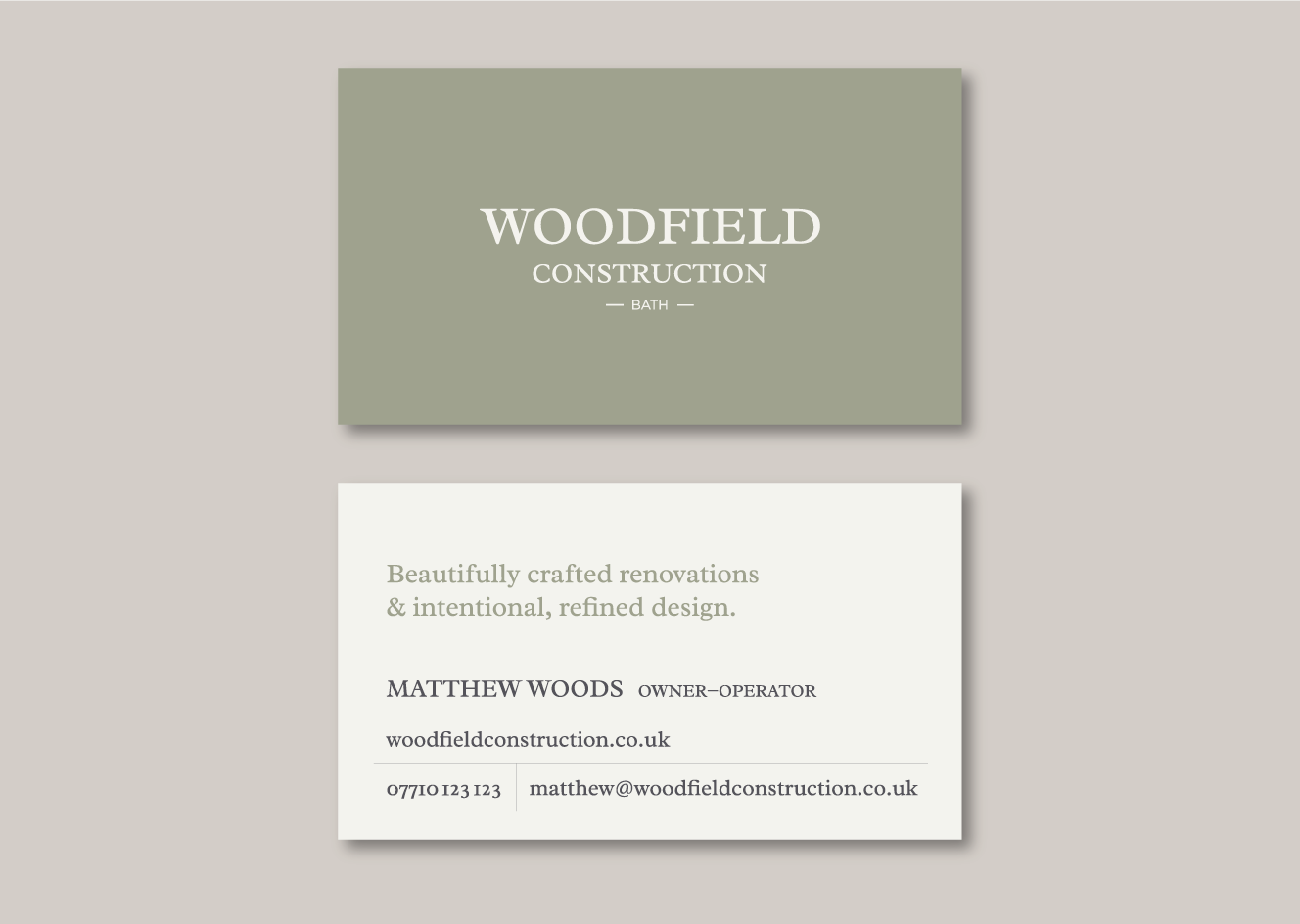
Woodfield Construction is a bespoke construction company in Bath, England, specialising in custom design and renovation projects. Woodfield Construction was looking for a new brand which reflected their attention to detail, sophisticated sense of style, and commitment to high quality work. We worked with Woodfield Construction on a complete brand suite including logo design, colour palette, website, business cards, and other brand assets to create a refined brand identity which connects with their clients and will scale with their business.
Brand Application
In the final phase of the design, we explored the use of black and white photography as part of the Woodfield Construction brand. Photographs of architecture around Bath, the historic city where the company is based, ground the brand in a sense of tradition whilst adding a sophisticated element of visual texture. We also explored how typographic details — such as the ‘fi’ ligature in the primary brand typeface — mirror the attention to detail with which Woodfield Construction approaches its projects. Each of these design elements is intentionally and thoughtfully developed in order to effectively communicate brand values and resonate with the target audience.


Design Process
This collaboration began with an in depth discussion about the vision for the Woodfield Construction brand. As a new company, in a highly competitive market, it was imperative that the brand connect in a meaningful way with its audience. Much more than simply a building company, Woodfield Construction offers the highest levels of quality, taste, and craftsmanship to its clients, guiding them through the transformation of their space.
We started with a client-designer collaboration on a joint Pinterest board, which we then analysed and refined into three distinct visual directions (represented in the following moodboards). Through this collaboration, the client was able to explore and communicate the many visual elements which appealed to them, and we were able to distill these ideas into specific strategies for the brand.

Moodboard #1
The vision for this moodboard was sophistication, refined detail, and bespoke design. The colours are soft, natural pastels — putty taupe, linen white, olive green, and ink black. We envisioned adding texture to the brand through thick, watercolour cardstock and debossed lettering in printing. We wanted this approach to feel luxurious and desirable — something Woodfield Construction’s clients would identify with and pursue in their home renovation projects.

Moodboard #2
This approach is slightly more masculine than the first, with bold sans serif typefaces providing structure and the mustard yellow providing an energetic contrast to the range of grey tones. The feel is contemporary, efficient, and professional, with texture coming from even, geometric patterns.

Moodboard #3
The final visual approach is earthy and rich, drawing texture from wood grain and using strong, squared off type. The colours draw from the natural environment — dusty white, bark brown, storm blue, and a coniferous green. This style is a more traditional match for a company specialising in carpentry, and seeks to communicate a team that is experienced and trustworthy.

Concept Development
From this point, we refined a final moodboard to get an exact representation of the brand “feel” we were trying to create through the visual brand and brand strategy. Together with the client, we had a specific idea of how the wordmark should look, though we continued to iterate through a number of variations until we found the one which felt most balanced and aligned with the brand vision.
Once the wordmark was complete and we had confirmed typeface selections and colour palette curation, we began work on business cards, signage, a showcase website, and a custom folder package for project quotes.


